Graphiant Portal

Transforming how enterprise teams configure and monitor global networks in real time.
Problem
Graphiant’s portal was built to simplify enterprise network setup and monitoring. But it failed to deliver: scaling out real hardware exposed limitations. The UI components looked polished—but couldn’t support configuration at scale. Navigation was confusing. CSV-upload setup never worked and was compounding bad design decisions on the portal UI. Live topology maps were empty. Engineers lost trust in the system.
Solution
We reimagined the portal as a live, digital twin of the network. Navigation was streamlined. CSV imports were replaced with reusable configuration templates and a Device Workbench. We built real-time traffic and topology diagrams with D3.js inside Vue.js components. Alerts were collapsed into a single actionable timeline. Monitoring dashboards showed clean defaults, letting anomalies stand out.

Impact & Results

The metrics that mattered most to our team.
50%
Reduction in enterprise network onboarding time
Graphiant cut setup from 8 weeks to 3–4 using centralized config templates in the Portal Workbench.
100K+
Devices managed with shared templates
Mixpanel logs confirmed large-scale reuse of configuration objects (device + site policies)
20:1
Reduction in alert noise
Platform captures 100% of network metrics without sampling and collapses thousands of events into one clear actionable alert per site.

User Research

We defined two key personas and mapped their actions, behaviors, and attitudes across key tasks. Most network engineers operate in noisy, high-alert environments—so clarity and calm were our goals.
We tested prototypes with our Sales Engineers and deployment team QAs, creating a repository of early demos and test results. Patterns we initially observed were later tracked with Mixpanel, giving us concrete benchmarks tied to core actions like triage, configuration, and navigation.
Header image
Upload UI element


Improvements

1. Action-Oriented Navigation


A split-screen annotated UI shows a network operations dashboard with navigation and incident management features. The top half displays a radial topology map with multiple rings of icons representing network devices and services. A highlighted red segment and dashed lines indicate an incident area. Labels identify features like “Acknowledge Incident,” “Review Notifications,” “Triage Timeline,” and navigation options such as “Topology,” “Monitor,” “Configure,” “Services,” “Support,” and “Account.”

The bottom half shows a detailed incident view for “Cleveland HQ.” It includes a mesh diagram of service paths, a red alert box noting “Edge 2 is offline,” and action buttons to restart or reconnect circuits. Metrics such as uptime, latency, and bandwidth appear at the top. Additional panels show Application Health, Circuit Utilization, Edge Device Status, and Routes across multiple edges. Red callouts point to “Granular Incident Detail” and various health indicators for CRM, VoIP, and productivity apps.
Problem
The original navigation required 4+ levels of nested clicks. Users got lost easily and often reset back to the dashboard. No clear entry to triage alerts or monitor device status.
Solution
Oriented the global structure around key activities and introduced a “god-mode” topology nav & a streaming incident timeline. Created a fast path to alerts, configs, and site-level drill-downs.
55%
Increase task completion from outcome-oriented navigation
25%
Decrease in home resets from proper router history and back navigation


2. Table Interactions Redesign

A dark-mode network interface table UI with multiple annotated features. The top shows a current state summary with “13 physical interfaces” and “31 sub-interfaces.” A keyword search bar allows filtering. The table displays columns for Interface, Type, Circuit/Segment, IPv4 Address, and IPv6 Address, with sortable columns, resizable columns, and expandable rows. A hierarchical structure shows sub-interfaces nested under primary ones. Config tags (e.g., “VoIP-Network-CLE”) are displayed in blue chips. Some rows show red status indicators like “Unavailable.” A kebab menu provides row-level actions such as Configure, Template, and Disable. The bottom contains pagination controls for navigating pages of data.A dark-mode UI row representing a data loading placeholder. The row includes several rectangular shimmer blocks that mimic the layout of a typical data table row. One block is animated with a blue gradient shimmer effect to indicate active loading. The row also includes a collapsed row arrow on the left and a vertical ellipsis menu icon on the right, suggesting row-specific actions will be available once the data loads. A red callout label at the top reads “Data loading placeholder.”A dark-mode table interface displays a list of edge network devices with bulk action controls. The top left shows a checkbox to “Select all” devices, with a label indicating “4 edge devices selected.” A dropdown labeled “Actions” reveals bulk actions: Configure, Restart, and Disable. A search bar allows filtering by edge name, and a “Provision” button sits beside a red “Create new” callout. The table includes columns: Edge, Address, IPv6 Address, and Configuration, with entries like “Edge-CLE-Gateway-01” and “Edge-CLE-VPN-02.” Each row includes checkboxes and kebab menus for individual control.
Problem
Earlier tables were designed around one device at a time—making them hard to use when managing fleets of hundreds. Critical actions like bulk-editing or sorting by segment weren’t possible. It was like reading a single email when you needed to triage your whole inbox.
Solution
Redesigned the tables with acceleration in mind. We introduced multi-select, bulk actions, and improved affordances for inspecting sub-interfaces and configuration templates. We tuned them for responsiveness, with filtering, pagination, and resizable columns.
40%
Faster task completion using row actions, bulk actions, and hierarchy
3x
Increase in usage of bulk-config tools and template application


3. Physical Device Port Mapping

A dark-mode network configuration interface shows detailed interface management for the device “Edge-CLE-VPN-02” (version 3.0). The tab “Interfaces” is selected, revealing a grid of physical ports (Gigabit Ethernet, SFP, Cellular 4G, Loopback) at the top. “GigabitEthernet1” is marked with a red error icon indicating a down state. Below is a searchable, paginated table listing 13 physical interfaces and 31 sub-interfaces. Columns include Interface, Type (WAN or LAN), Circuit/Segment (with color-coded tags), IPv4 Address, and IPv6 Address. Two SFP interfaces are marked “Unavailable.” Labeled callouts identify features like “Dynamic model-based layouts,” “Controllers mapped to physical ports,” “Interface Down State,” and “Full tabulated interface record.” A timeline alert at the bottom right reads “⏱ 1h 5m.”A dark-themed network UI element displays port icons representing different interface types. The left group shows two ports: one labeled “W” (WAN) with port number 2, and one labeled “L” (LAN) with port number 3. The right group shows a single port labeled “A” (likely ADMIN or AUX) with port number 1. Red callout tags label “Port Type” and “Port Number” to highlight the meanings of the symbols and numbers. Each port is visually represented by an Ethernet jack icon.
Problem
Even with dozens of virtual interfaces, every network flow ultimately connected to a physical port. With only table rows, users couldn’t easily see port status, type, or navigate between devices.
Solution
We mapped every physical ports directly in the UI. Port buttons triggered context-specific forms and sub-interface tables, linking visual states to interface details, reducing guesswork and errors.
2x
Faster interface triage from port-mapped devices
5x
Increase in interactions with the sub-interface table


4. Configuration Templates

A dark-mode interface for network configuration management is displayed with multiple labeled UI components. The page is titled “Network Configuration” and shows four main cards: Connectivity, Services & System Roles, Security & Access, and Traffic Control. Each card contains drill-down buttons (e.g., “WAN Circuits,” “Syslog Servers,” “Security Policies,” “BGP Peers”). A top bar includes navigation tabs for Templates, Sites, and Edges (representing reusable logic, geography, and individual devices, respectively), along with a keyword search input and a Create button (onboarding CTA). Red callout labels identify UI elements such as “Usage summary,” “Re-usable logic groups,” and a timestamp alert reading “⏱ 1h 5m.” The sidebar contains icons for navigation and help.


A dark-themed UI interface for managing IPFIX templates. The top section titled “Creating an IPFIX Template” allows users to enter template details such as Template Name, LAN Segment, Host/IP Address, Port, Monitored LAN Segments, and Interface. Each field includes chips for multi-select and typeahead input. The “Save Template” button is prominently displayed. The bottom section lists existing templates in a table with columns for Template Name, Collectors, Edges, Sites, Monitoring, and Interface. Colored chips and status icons (e.g., warning, error) indicate the scope of use and status of each template. Red callout labels annotate features like “Inline template creation,” “Typeahead input accelerators,” and “Template status and scope-of-use.”
Problem
Engineers were expected to configure devices using flat CSV files. This approach made it nearly impossible to scale network blueprinting across hundreds of locations. There was no shared logic, no reuse, and no visibility into what templates were actively in use.
Solution
We introduced reusable configuration templates. Engineers could now define circuits, services, rules, and routing as modular templates and apply them across edges and sites, giving teams a flexible, scalable way to define infrastructure intent.
50%
Faster enterprise network setup times
100K+
Devices managed using shared config templates


5. Network Topology & Triage Accessibility

A radial network topology diagram in dark mode displaying three concentric rings. The innermost ring contains a central logo surrounded by a red segment labeled “Regional anomaly highlight.” The middle ring is labeled “Sites logical ring” and displays various site type icons (e.g., data tables, folders). The outermost ring shows “Edge device ring” icons, each with associated numeric badges representing “Device counts.” A segment of the diagram is shaded in red to indicate a problem region, with dashed and colored lines pointing to issues marked by warning and error icons. Labels highlight key UI components including “Logical site type icons,” “Sites logical ring,” “Edge device ring,” and “Device counts.”


A labeled interface mockup of a network monitoring dashboard showing both light and dark UI modes. The central panel visualizes site connectivity with a mesh of nodes representing portals, edge devices, circuits, and services. Red dashed lines indicate disconnected paths; yellow lines show warnings; solid lines show active connections. Red labels highlight UI features: “Site metrics summary,” “Tooltip on hover,” “Connection highlights,” “Graphiant service connections,” “Edge device connections,” and “Site circuit connections.” The right panel shows a real-time alert summary with a red box indicating “Edge 2 is offline” and a yellow warning for latency and packet loss. Additional features include buttons to restart, reconnect, or failover, a timeline scrubber for device state history, and a time-based triage action panel.A circular radial diagram with a central multicolored logo surrounded by layered concentric rings and node branches. Each branch extends outward and terminates in small icons representing various entities or data types, such as folders, tables, maps, stars, and gears. Most of the branches are shaded in purple, while a few segments in the upper right are highlighted in light red or orange, indicating warnings or errors. One red path leads to a red “X” icon and a warning triangle. The interface is in light mode with a clean, modern aesthetic, likely representing system topology or data flow visualization.A segmented toggle button for selecting a UI theme. It includes three options: “Light UI,” “Dark UI,” and “Default.” The “Light UI” option is currently selected, indicated by a bold white font on a blue background. The other two options are in dark gray text on a white background with thin gray borders.
Problem
Real-time triage was buried under stacked alerts and dense tables with multiple indications of statuses. Network anomalies were hard to spot—and harder to explain to others. Complex navigation provided no way to correlate alerts to device state, or compare behavior across time.
Solution
We unified alert history, streaming metrics, and device diagrams into a single model. Glyphs, motion, and stroke styles signaled connection health. The timeline supported rewind and annotation. Line style and iconography clarified site status—even from across a NOC display wall.
20:1
Signal to noise ratio achieved via alert aggregation
<30s
Required to successfully identify root cause of alert
A simple illustration of a ghost character in front of two stylized web browser window outlines. The ghost has two circular eyes and a small smile, representing a playful or friendly design. This image is commonly used as an empty state or “nothing found” placeholder in user interfaces, indicating no search results or data to display.

Going from Zero to One: Embrace the Mess

Design had to move fast—often through ambiguity and without direct user access. We embedded in engineering and PM meetings, used hypothesis-driven sprints, and ran quick recall tests to validate early topology ideas. Much of the early misalignment came from assumptions like 'CSV templates are a configuration tool.' Strategically, I Trojan-horsed better design into everyday work—turning critiques into questions and static diagrams into systems thinking.
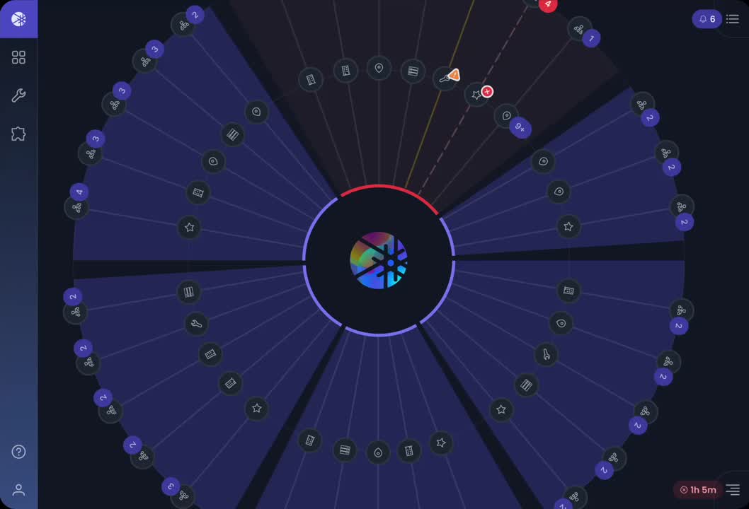
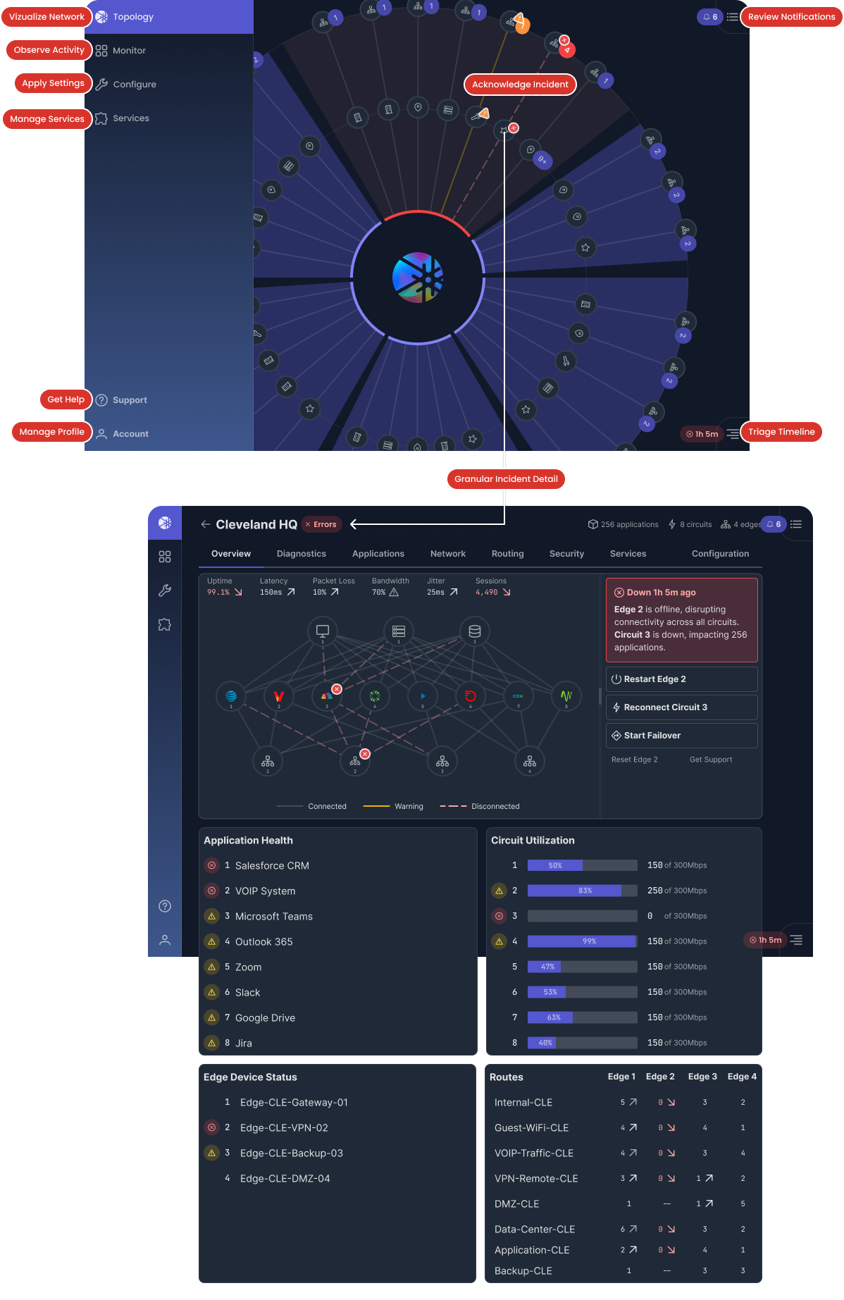
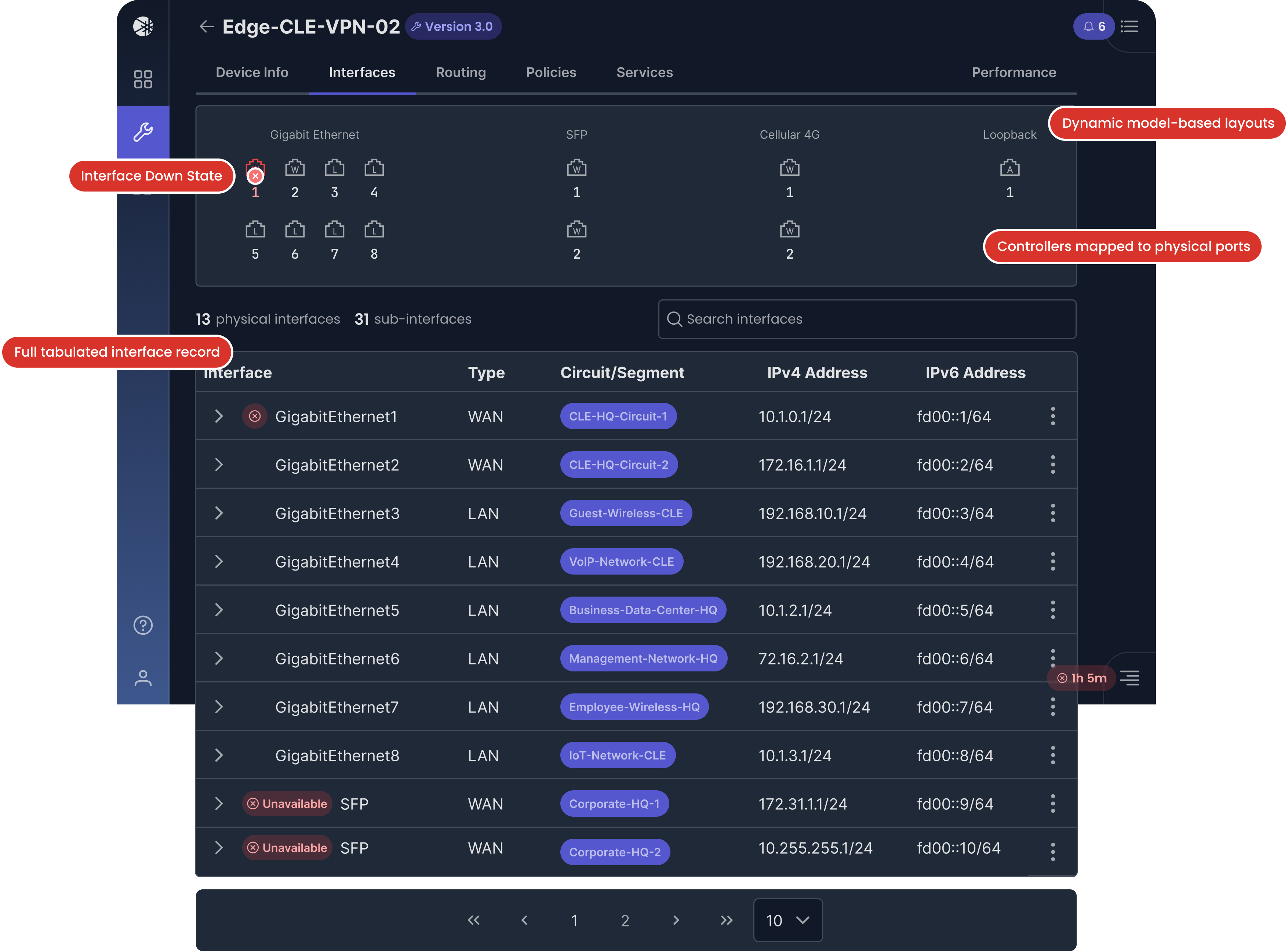
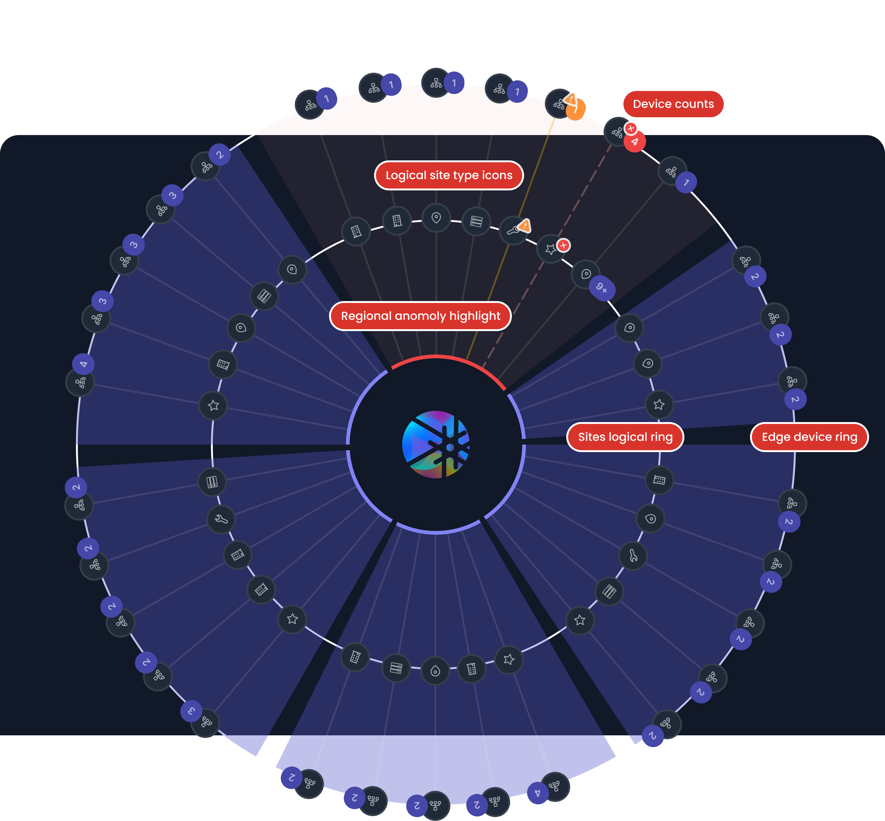
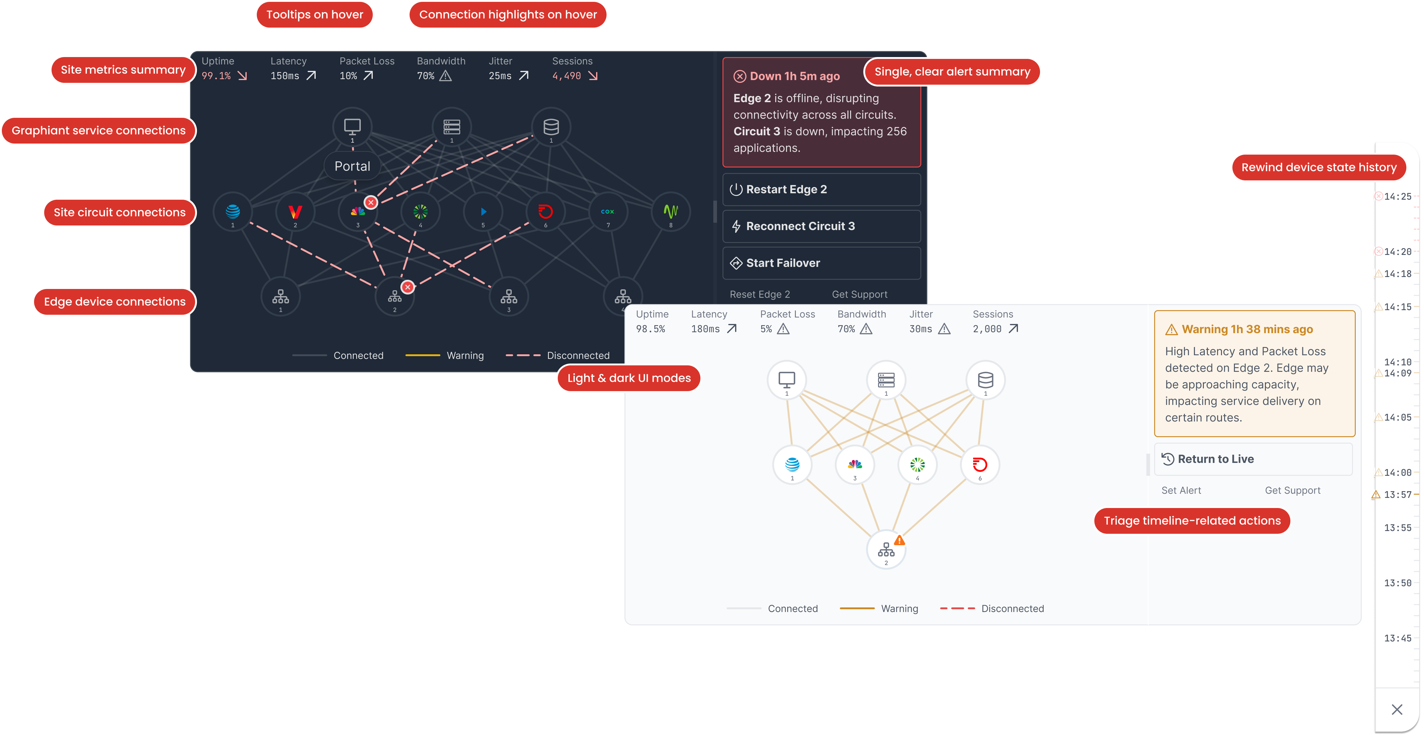
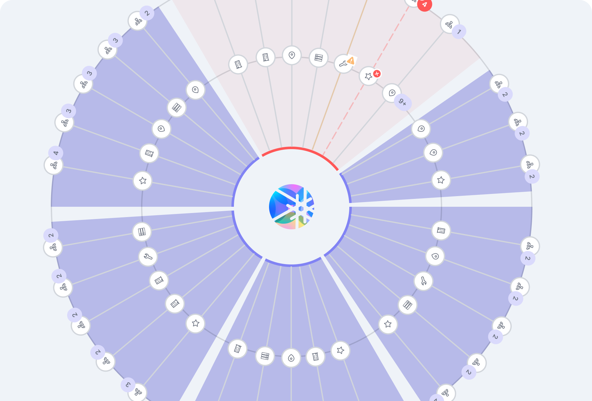
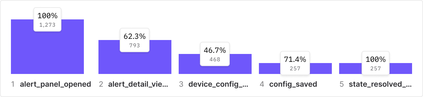
Our sprint process involved backlog refinement with PMs and FEEs, co-writing acceptance criteria and usability testing prompts. One early example: we tested our network topology prototypes by giving users a 30-second glance and asking them to recall and interpret the state of the network. These fast-turn tests eventually helped us steer Mixpanel implementation while keeping alignment across the team.

Don’t just take my word for it

Here are highlights from the performance reviews I've solicited from my team.
"Bobby tackled everything from day-to-day tasks to complex features. He always keeps a user-centered focus—whether in concepting or usability testing. Because of his efforts, our clients and our design team has a real sense of direction."
Mili Kuo, Senior UI Designer
Mili Kuo
Product Designer
"I’m grateful to have worked with Bobby. He’s been crucial to Graphiant, consistently delivering and bridging communication between our teams. His daily presence improved our velocity and morale—even in a remote-first setup."
Kristen Gee, Product Manager
Kristen Gree
Product Manager
"It was an honor working with Bobby and I'm sorry we couldn’t retain him as long as we wanted. Regardless, his impact on streamlining onboarding and championing design ops is undeniable. We’re thankful for the path he set."
Arsalan Kahn, Director of Software Engineering
Arsalan Kahn
Director of Software Engineering
© 2025 Robert Duebelbeis — All rights reserved